IELTS Writing Task 2 – Unpaid Community Service: Some people believe that unpaid community service should be a compulsory part of …
IELTS Writing Task 2 – Unpaid Community Service: Some people believe that unpaid community service should be a compulsory part of …
IELTS Writing Task 1 – UK Telephone Calls: The chart below shows the total number of minutes (in billions) of telephone calls in the UK…
IELTS Writing Task 2 – Children Learning Language: Some experts believe that it is better for children to begin learning a foreign …
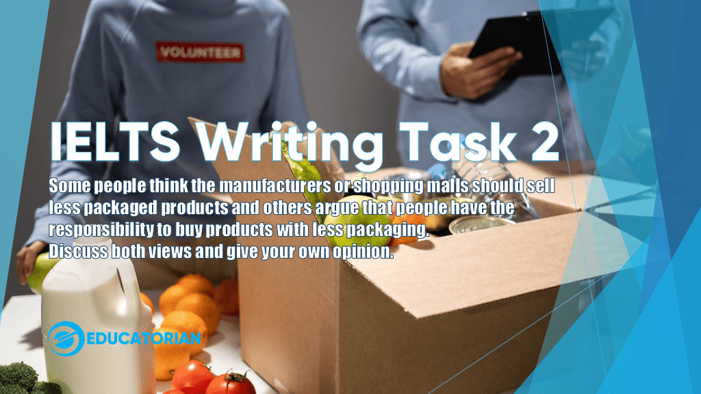
IELTS Writing Task 2 – Less Packaged Products: IELTS Writing Task 2 (Academic)Some people think the manufacturers or … Read to learn more.
IELTS Writing Task 2 – Faster Public Transportation: Some people think that governments should spend money on faster,,, Read to Learn More
IELTS Writing Task 2 – Spend Free Time With Families – Some people think that young people should spend free time with families instead….
IELTS Writing Task 2 – Reading for Pleasure Reading for pleasure can develop imagination and language skills better than watching TV.
IELTS Writing Living in Cities: The graph below gives information about the percentage of the population in four Asian … Read More.
IELTS Writing Task 1 AC: Sugar Production – The diagram below shows the manufacturing process for making sugar from sugar cane. Summarise …
IELTS Writing Task 1 AC: Adult Education – The charts below show the results of a survey of adult education. The first chart shows the ….